How Staring at Screens Resulted in the Iris: 20-20-20 App

Nowadays, most of us spend a good chunk of our time staring at screens. Whether it’s a computer monitor, a smartphone, the television, or even a smartwatch, our eyes are constantly getting put to work by all these screens. Too much of one thing is never good, and this definitely applies to looking at screens.

Prolonged exposure to screens can result in eye fatigue, headaches, blurred vision or dry eyes. I have experienced this myself, especially since I work on the computer during my day job, and I usually end up staring at more screens at night: whether it be playing video games, watching some Netflix, or even working on my apps.

This is where my new app, Iris: 20-20-20 Rule Eye Strain Assistant & Helper, comes in. Since I’ve been experiencing minor headaches and eye fatigue due to too much screen time, I made it a point to try and follow the 20-20-20 rule. It’s a popular guideline often recommended by eye doctors for reducing eye strain and it goes something like this:

Every 20 minutes, take a 20 second break to look at something at least 20 feet away.

The Iris: 20-20-20 app helps you achieve this. Once the app is switched on, it will remind you to take a break every 20 minutes. When it’s time for a break, you then open the app, and tap on the timer to start a 20-second countdown. This is when you look at something that’s at least 20 feet away while holding your device; because when the 20-second timer is complete, it will vibrate, signaling you that your break is over. Rinse and repeat throughout the day (and night). It’s that simple.

I hope that you’ll find this app as useful as I (and our beta testers) have! It’s incredibly efficient and it has really made a difference in my daily workflow. Note that you can always get up and move around during your 2o-second break. It’s up to you what you do as long as you give your eyes a chance to look at something at a distance (20 feet or farther). I hope you’ll give Iris: 20-20-20 a try – your eyes will thank you for it!

WeKey Review

Virtually every new device with a screen released today supports bluetooth keyboards. Bluetooth keyboards have come a long way; with the rise of tablets and smartphones, they are now an essential part of a professional’s arsenal. That is why I was quite excited to receive the WeKey from Product Ninja as part of their awesome Trials program. Today, I present to you my thoughts on the product.

Look & Feel

IMG_3239

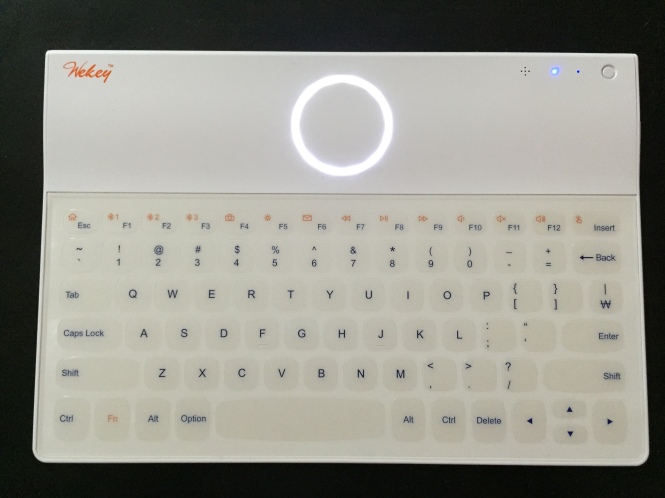
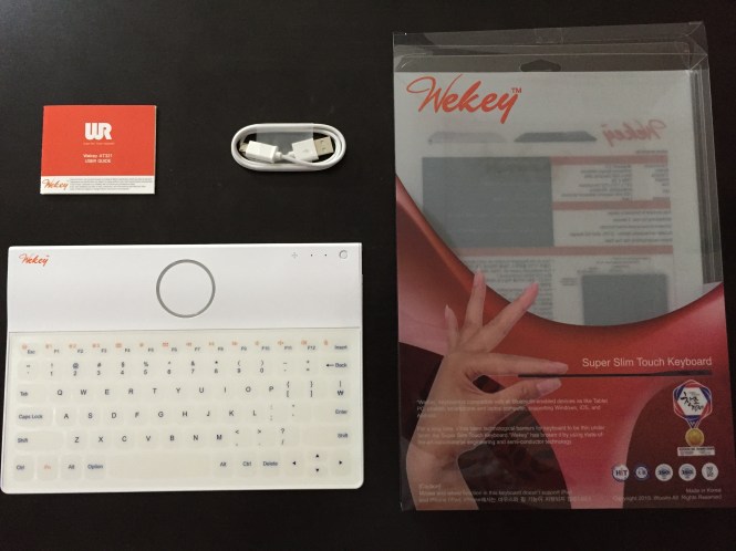
As you can see, I received the white version of the device. It also comes in black, which I would’ve preferred, but that’s purely subjective. As far as the layout goes, it’s pretty typical to what you would see in a portable bluetooth keyboard. We have the usual QWERTY set up and a ‘Fn’ button to activate certain functions.

The most unique thing about this keyboard is the circular button up top. That’s a trackpad. I really like the halo around it, it makes the keyboard look very sleek and futuristic. As you can see on the top right, there is a blue dot to indicate connectivity status and a small circular button to start the pairing process.

Another great feature of this keyboard is its ability to connect it to three bluetooth enabled devices and swap between them instantaneously. If you take a look at the ‘Fn’ functions above F1, F2, and F3, you’ll see the ability to swap between the connected devices. This makes working on your laptop, tablet and smartphone effortless.

IMG_3238

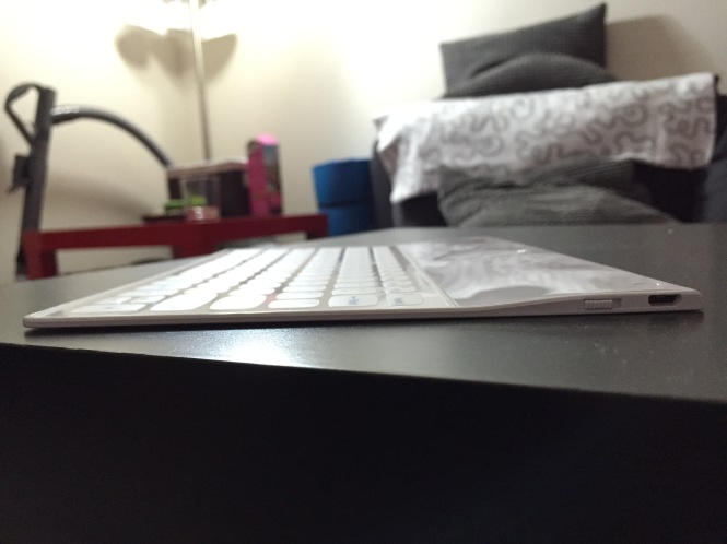
As you can see, this keyboard is very thin. Because of this, the keys are actually just touchpads. There doesn’t seem to be a mechanical structure underneath it, so it definitely needs some getting used to. The keys don’t “press” down as you would expect them to, you’re essentially just “tapping” on them. I personally have a hard time getting used to this because it’s hard to judge whether you pressed the key or not without the physical feedback of pressing a button in. There is however, a sound that emits from the keyboard that can be used as confirmation that the key has indeed been pressed. Unfortunately, that sound can be extremely annoying and maybe even disruptive to the people around you, so I prefer to have it silenced.

On the side, you’ll also be able to see a On/Off switch and a charging port that uses a mini-USB cable, which is included in the package.

As far as how the keyboard actually feels, I’m sorry to say that it can be summed up as cheap. The lightness of the keyboard, although nice, doesn’t help to give it a premium feel. It definitely doesn’t shy away from being made from plastic, and its backside is composed of a faux leather material. In short, it doesn’t feel all that great.

Functionality

Through the photos, you can get an idea of how it looks and perhaps feel, but how does it function? In summary, it’s okay. The biggest problem is the touchpad keys. You have to press on them pretty hard for them to register, which results in slower typing and many typos.

The trackpad is a welcome function, but its surface isn’t the best. Gliding my finger around, I noticed it is too stick – too much friction. Yes, you can successfully navigate around your desktop using the trackpad, but it isn’t the smoothest or the nicest experience.

The pairing process works perfectly fine and the swapping between devices works great. It’s unfortunate that the keys are clunky, because after all, that’s the main purpose of a keyboard.

Verdict

IMG_3236It’s tough to recommend this product at the current price point I see on Amazon ($73.39 at the time of this review). If it were half the price, I’d say go for it. At its current price point, there are much better alternatives.

Keep in mind that it does pass all the claims it makes. It is by far, the thinnest and lightest Bluetooth keyboard I have ever used, and while I did not test its water resistance claim, I can tell by the build and lack of crevices that it will withstand spills better than other keyboards. The battery life is also terrific.

So there you have it, it’s a great idea but the poor build quality and usability really hurts the product. This won’t be replacing my everyday keyboard or my portable travel keyboard, but it does have a home at my living room. I plan on using this keyboard for my PS4 and whatever other Bluetooth-enabled device my home theater might soon have. It’s perfect for some light typing, but not for producing professional work.

The First 4 Things You Need to Do With Your New Apple Watch

Congratulations! You just took your first step into the very fun and interesting world of wearable technology. The Apple Watch is arguably the best device in this category. Here is a list of must-dos to get the most out of your new watch:

Pair it with your iPhone

This one’s a no-brainer. The Apple Watch is pretty useless when unpaired. Before you begin, make sure your iPhone is running iOS 9 or later, and that Bluetooth is on. Turn on Bluetooth by going to Settings > Bluetooth on your phone. You must also be connected to Wi-Fi or have cellular service.

Pairing is a simple process that you start by turning on your Apple Watch; you can do this by pressing and holding on the larger button on the left side of the watch until you see an Apple logo. Follow the instructions that appear on your watch.

While doing this, make sure both your iPhone and Apple Watch have at least 75% battery, if not, you can still do the pairing process while both devices are connected to a charger.

Set up security and PIN

IMG_3022

It is always advisable to have a passcode or PIN lock on your mobile devices, and the Apple Watch is no exception. After you pair your device and set up preferences, you will be asked to create a numeric passcode. Do that, and make sure you say YES when it asks if you’d like to unlock your watch with your phone. This means that as long as you are wearing your watch and your phone is nearby, you don’t have to enter your PIN every time you need to use your watch.

Wait (bonus step)

After the initial pairing and set up process, your watch screen will display a circular loading bar with an Apple logo in the middle. This could take a while, so it is recommended that you just set both your devices down and periodically check on its progress.

Set up the Activity App

IMG_3025

Once your Apple Watch is fully set up, I’d recommend setting up the Activity app. This app will help keep track of daily activities such as minutes exercised, calories burned, etc. It’s a useful thing to have even if you don’t regularly visit the gym. It also reminds you to stand-up once in a while to avoid sitting for too long (hint: that’s bad for you).

If you want to take it a step further, you can even add your weight, gender and height to the “Health” section of the “Watch” app on your iPhone. This allows the watch to record data more accurately to help improve your health.

Customize your watch face

IMG_2841

One of the best parts about the Apple Watch is that it is such a personal device. There are quite a few watch faces to choose from and even more ‘complications’ to use. This is my favorite part. No other piece of technology lets you express yourself like the Apple Watch. To enhance this experience, I even created an app called Watch Widgets, that lets you put text, emoji, photos and unique icons on your watch face. To customize your watch face, do the following:

  1. Hard press on the current watch face.
  2. Scroll until you find a watch face you like.
  3. Tap “Customize”.
  4. Swipe left and right to customize different parts of the watch face (i.e. color, detail, complications). You can use the digital crown to scroll through options.
  5. Once you’re done, hard press on the watch face, and then tap it to use.

There you have it! You are now ready to wear your watch everyday and show off your cool new, “timeless” gadget.

Apple Watch + Spotify = Playlist

From weekend hack to reality, Playlist: Spotify Player for Apple Watch is now available in Apple’s App store! When I first purchased the Apple Watch, I was very disappointed to find out that Spotify didn’t have a native Apple Watch app. Without hesitation, I made it a personal mission to create one! Luckily, Spotify had an iOS SDKs readily available. It worked like a charm even though it’s still in beta. It took a while to get the SDK and WatchKit to play nicely with each other, but I got it done eventually!

I hope you all enjoy the app as much as I do! If you find any bugs or have suggestions, I’m always available on Twitter at @J_Ceniza

Give it a download!


Playlist: Spotify Player for Apple Wath is a compact, streamlined music player for the Apple Watch that connects to your Spotify account.

From your watch you can:

– Control music
– View your playlists
– Play songs from your playlists

Note:
– Requires a Spotify premium account.
– Music will be played from your iPhone, not the watch

For questions and suggestions, contact the developer on Twitter at @J_Ceniza.

Enjoy!

What makes a “good” iOS App?

This post is part of a lesson in Udacity’s iOS Nanodegree that I’m currently taking. The lesson asks us to reflect on what we makes iOS apps “good.”

Having owned and iPhone for the past 7 years or so, and having programmed iOS apps for the last 4 years, I believe that I have a pretty good idea of what makes an iOS app great. In the most general sense, a great iOS app should have these four characteristics:

1. The app is super user-friendly to the point where a brand new iPhone user can figure out how to use it, even if this is the first app ever they’ve ever opened.

This is very important. App developers, spending so much time in the iOS ecosystem, tend to have a deeper understanding of apps and therefore might be biased as to what makes an app “easy” to use. Something seemingly simple to them (i.e. gestures such as press and hold) might be quite complex to the average user.

2. The app takes advantage and is mindful of the screen real estate of the device it is running on.

Whether an app’s main purpose is for the consumption of information or for productive purposes, developers need to be mindful of screen size. Since a smartphone’s screen is much smaller than a computer’s, it is important to show only necessary and vital information. Too much information and UI elements in one view can cause confusion and frustration. You don’t want this, since a tiny hint of frustration could easily cause your app to be deleted and replaced!

3. The app is useful.

This is a very broad statement, but it is accurate. With millions of people owning a smartphone, there are bound to be many definitions of usefulness. So to be succinct, an app should be useful to at least a small group of people; a niche, if you will. Some of the biggest and most valuable apps today started as niche apps.

4.  The app’s design is attractive.

First impressions are everything, especially when you’re competing with millions of other apps, a few of which probably have the same exact functions as yours. One way apps distinguish themselves is through design. Great design can lead to a better user experience, which can then lead to users converting their friends to users.

The above are just some quick thoughts I have on what makes an iOS app great. They are to be taken as a whole, and never focus on just one individually. They must all be considered when brainstorming a new, wonderful app to create.

How would you invert the colors of an image in Swift?

As part of the first lessons associated with Project 1, “Pitch Perfect” in Udacity’s iOS Swift course, we (the students) are asked to blog about a specific topic related to how things are done in Apple’s new programming language, Swift. As you can see from the title, I’ve chosen to write about how to invert the colors of an image.

First, I’d like to discuss how to actually load an image onto the screen. The first step would be to open up your Storyboard and add a UIImageView object to the view. This object will allow you to show images (adhering to UIKit’s UIImage class) within its bounds.

The next step would be to go into your project’s Images.xcassets and drag an image into the editor. Let’s call this image “theImage.png”.

Once the image is in our project, we can set the UIImageView’s image attribute (in Storyboard’s “Attribute Inspector”) to our desired image. Next, we must connect the UIImageView to our viewController code by opening the Assistant editor mode and holding CTRL + drag from UIImageView to above the viewDidLoad function. This ensures that we create an outlet between our controller and view, and that it is treated as a global variable, allowing us to manipulate it in whichever functions we desire.

Finally, some code. Here are the steps we need to do:

1. Grab the image from our UIImageView and store it as a UIImage class (we will call this “theImage”)

2. Initialize CIFilter object. This is a class within Apple’s Core Image framework that has a dictionary that defines the attributes of a filter that it represents. There are many filters available, one of which is a color inversion filter.

3. Apply the CIFilter to “theImage”

4. Create a new UIImage to store the filtered image – let’s call it “newImage”

5. Show “newImage” on the UIImageView on our view

The code for the above steps are as follows:

let theImage = ourImageView.image //this takes the image currently loaded on our UIImageView

let filter = CIFilter(name: "CIColorInvert") //this creates a CIFilter with the attribute color invert

filter.setValue(CIImage(image: theImage), forKey: kCIInputImageKey) //this applies our filter to our UIImage

let newImage = UIImage(CIImage: filter.outputImage) //this takes our inverted image and stores it as a new UIImage

ourImageView.image = newImage //this shows our new inverted image on our UIImageView on our View

That’s it! The Core Image framework seems to be a very powerful one, and you definitely have to read through the documentation at least once. Here’s a link. Strangely, the Core Image framework seems to be automatically included when creating a viewController.swift file (I didn’t have to do a ‘import CoreImage’ statement). I wonder if this is the case.

The Apple Watch From the Perspective of a Hobby iOS Dev/Normal Guy

Remembering that I’ll be dead soon is the most important tool I’ve ever encountered to help me make the big choices in life.

– Steve Jobs

Big choices. That’s what the Apple Watch was about. It is a symbol of Apple’s foray into fashion. There is no doubt about it, this is a fashion play. In the tech space, price tags of $10,000 are reserved for supercomputers and professional equipment. But a watch is a statement on fashion and, in this scenario, wealth.

Apple has evolved, from its humble beginnings into a social status symbol. With the introduction of the Apple Watch, they are taking it to the next level, from passively enjoying their perceived status symbol to fully embracing, and even flaunting, it.

Although I am skeptical of the watch and its purpose, I welcome their innovation into a new space. Apple has billions of cash in the bank, and it is time for them to take a risk. I think all invested parties, from developers to stockholders, will be pleased that something new and noteworthy has emerged from Apple’s super secretive R&D lab.

So what does this mean for the developers? For the big players, it is another way they can differentiate themselves. The battle for user attention is at an all time high on the smartphone screens. Big developers can afford to utilize the second screen of the watch to continue capturing the user’s attention; constantly pinging them, reminding them that, “Hey, this app is still here – check it out on your watch or your phone.”

After taking a break from Pxture and messing around with WatchKit, Apple’s developer tools for the Apple Watch, I definitely see some potential. It is clearly designed to be used sparingly and for short periods of time. It is almost strictly design for notifications related to app’s you already have installed on your phone. It is designed for active, busy folks who have money to burn. I can see professionals using it to remind them of meetings, appointments and errands. For similar reasons, I can see busy parents using it as well, and I can definitely see athletes/gym-goers using it to track progress. However, I can’t picture teens using it. They’re constantly glued to their phones and they have no real reason to put it away. Perhaps Apple will eventually aim their marketing towards teens, but for the moment, it is aimed at those who can afford “luxury tech.”

It’s an interesting and grand time for technology. As components get smaller and smaller, it becomes easier for companies to get creative and put displays on otherwise unimaginable places. It all started with a screen in your living room, then one on your desk, then one on your lap, and finally, one on the palm of your hands. Now Apple is betting that jewelry and fashion will be the next frontier that screens will conquer. Only time will tell.

5 Outrageous Things You Can Do With Apple’s $18 Billion Quarter

If you haven’t heard, Apple just broke the record for achieving the highest earnings in a single quarter for a publicly traded company. They did that by netting $18 BILLION in income with $74.6 billion in revenues. Much of this success can be attributed to massive iPhone 6 sales.

But enough with the finance talk. What I really wanted to know is what you can do with $18 billion. I’m not referring to how many companies they can buy or how many stocks they can buy back. I much prefer to measure their money using more creative means. With that said, I’ve done the math and give you 5 outrageous things you can do with an $18 billion quarter:

1. Buy one, top of the line Tesla P85D every minute! That’s right, $18 billion per quarter breaks down to about $137,668 of profit per minute. I highly doubt Tesla can keep up with that kind of demand.

2. Generate 13x the GDP of American Samoa in a single month! According to Wikipedia, American Samoa’s GDP is approximately $462.2M. Not too bad for a growing country, but pales in comparison to the kind of money Apple can generate. Apple generates about $6M per month based on their most recent quarter.

3. Cover the distance between the moon and Earth 7 times by stacking $1 bills end to end! How crazy is that? If we obtained $18 billion in singles, and stacked them end to end, it’s enough to make 7 stacks that touch the surface of the moon.

4. Fill 12 Pyramid of Gizas. A single pyramid of Giza can’t contain all those dollar bills. Once again, $18 billion in singles can fill up to 12 Pyramid of Gizas (if there were 12 of them). You need approximately 1,428,331,318 singles to fill one pyramid.

5. Cover the entire country of India TWICE. You read that right. With $18 billion worth of singles, you can cover all of India with two layers of $1 dollar bill blankets. Bad at geography? To put it in perspective, that equates to covering approximately 75% of the United States of America. That is a lot of surface area, my friends.

So there you have it. I hope these visualizations give you get a better sense of how much $18 BILLION really is. In short, it’s A LOT.

p.s. Feel free to check my math!

A Real iPhone 6 Leak?

With Apple’s annual “iPhone conference” only two days away, the internet was bound to explode with more speculation on what the iPhone 6 will be like. However, it seems that the internet has graced us with something even better. A Chinese website has leaked an actual, functioning iPhone 6. Or at least they claim so.

iphone 5s vs iphon 6

I follow iPhone news pretty closely and I have to say that this is the most legitimate leak I’ve seen so far. I do have to caveat that with a couple of red flags. One thing that Steve Hemmerstoffer, writer for NowhereElse, pointed out was the unusually long minute hand of the clock app when compared to the current clock app on the iPhone 5s. The video also shows the camera lens protruding out the back of the iPhone. This pretty much goes against Apple’s design dogma of flat, smooth surfaces and round edges. However, there were reports of the camera lens using extremely scratch-resistant sapphire glass possibly allowing it to protrude without being easily damage despite being exposed.

Aside from the items mentioned above, everything else, from the physical phone to the software, is in line with what’s been rumored to be part of the iPhone 6 experience. Most importantly, the Passbook app has an extra stripe above it portraying a credit card, which seems to support the idea that the iPhone 6 will support mobile payments (read NFC). This is a gigantic upgrade allowing users to pay at retail terminals with their iPhones, presumably using your iTunes credit card they have on file.

It’s going to be an exciting week. I personally can’t wait to see what the iPhone 6 has to offer, especially since I’m planning to upgrade from my very slow iPhone 4.  See the full video of the leak below: